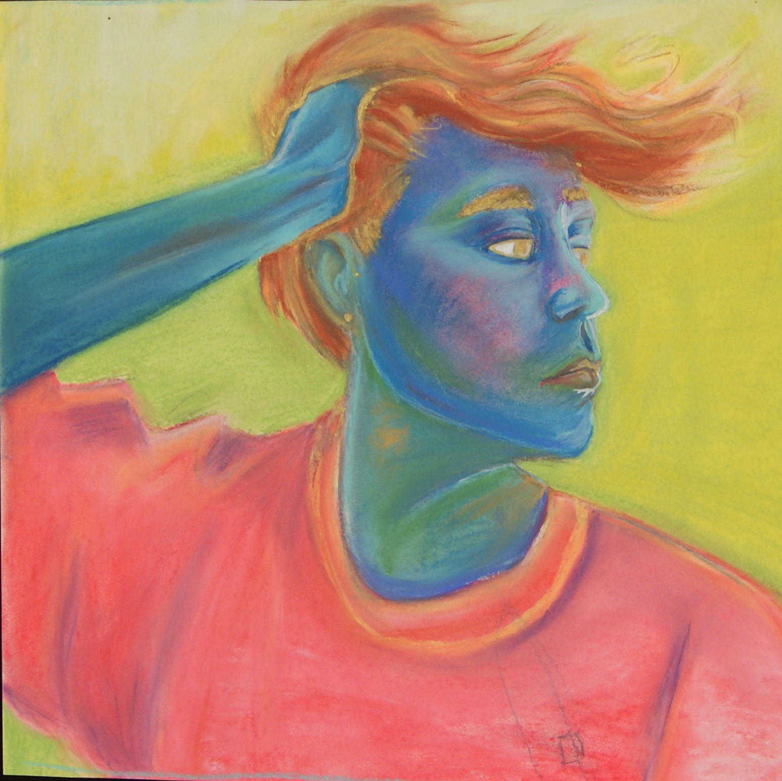
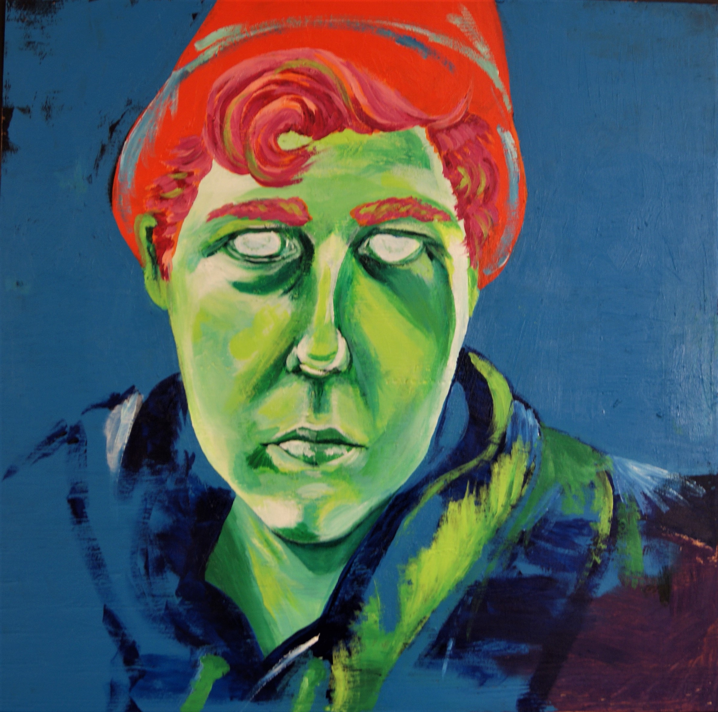
Self Portraits
Doing self portaits is always a struggle for me, I often find that it's hard not just to find image that I think is flattering of myself but that will also translate well beyond the image. Both portraits were done with photo and life reference, the first relied more heavily on image than the second due to the pose aspect, but had a much better result in the end.
One of the challenges with these pieces was using the cool colors used for the flesh, since it's not often that greens and blues are used in the face. It was hard to try and not make the portraits appear alien with the coloring, so it was important to try and at the least keep the pieces looking humanlike if not "Johnlike." Neither one is completley proportionate, but at the very least they have elements of my actual appearance.
I like the chalk pastel portrait much better than the acrylic one in the end. I think one of the biggest struggles was how I actually worked on each one, since the pastel portrait was done taped to a wall and upright, whereas the acrylic portrait was lying on the ground and resulted in a distorted image. The face in the second is far too long, and is sadly proportionate if tilted at a slight angle.
Even if it had been proportionate, the use of colors in the chalk portrait is something I feel was done much more skillfully. Unlike the acrylic portrait which is all vibrant and bold colors with fairly defined lines, I enjoy the blended quality that the pastels added, and while the hair isn't very successful I think that it's very effective on the skin.